Research

1. The BFI film festival front cover has a few key conventions on it. The first key convention on the front cover is title of publication, the title of publication on the front cover is 'BFI London Film Festival'. There is no slogan or central image in this specific front cover. This differs from magazine covers as it promotes films that are going to be shown in the cinema, the front cover doesn't need to have prizes or tournaments that a usual magazine cover has.
2.
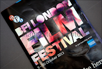
One thing that stands out from this front cover is the colour scheme that has been used. It is vibrant which will be more likely to attract a larger audience. The smoke around the text itself makes the whole cover stand out.
The one key feature that appeals to me is the central image that has been chosen for this front cover, it covers majority of the page and is effective in the way it promotes BFI. It doesn't have a picture of a main character but something which is similar to a mannequin.

The central image and the black and white colour scheme both compliment each other well and is something that could be done with my front cover as it is to do with a noir film.
The key thing that stands out with this is the multiple images to make the front cover, this is useful as it tells us the content about the leaflet itself and what other things could be included in it.
The use of no central image is effective as it just shows the name of the art house cinema. This is effective as the audience are able to identify what cinema this is once engaged with the front cover itself.
3.

This context page shows each page with a picture so the audience know what they're looking at and can also use the use of a photo to help them. This helps it stand out from others as other context pages only have the page number.
 The use of the plain black on white text is also very effective as it is simple and still works well. The use of the colour scheme and the lay out itself of the leaflet makes it easier for the audience to pick what page they want to go on.
The double page layout and the headlines for each film makes it easier for the audience to find the specific film that they want and the use of the only image being smoke is also effective; it gives the leaflet a more professional look.

The yellow heading and no central image makes the leaflet more professional the audience can find what they want to read quicker and also has it in chronological order which is beneficial. The context page is also going portrait rather than landscape in this case.
Photoshoot
1. The main character that will be on the cover of my front cover for the programme will be Warren Russ who's the main character of the film, he is the undercover detective who infiltrates the gang.
2. The images that will be required for this will be a shot of the main character dressed up as a police officer(formal suit) but also as a member of the gang he has to join. This will highlight both identities of the police officer and gang member.
3. Long shot of the protagonist
Medium shot of the protagonist
Close up of the protagonists face
Extreme close up of protagonists eyes
Close up of hand with a weapon being held
Worms eye shot of the protagonist
4. The costumes that will be required will be a suit and clothing worn by gang members such as a hoodie and jogging bottoms which are black. The prop that may be used could be a weapon that the protagonist will hold.
5. We'll make sure everything is prepared as the shot list and costumes will be ready. This way the photoshoot will be able to take place as the protagonist has his clothes and the prop will be ready. Additional research and planning will be done.
No comments:
Post a Comment